Section settings
Every section in the theme includes comprehensive settings that control layout, appearance, and behavior. These universal settings ensure consistent design while providing flexibility to customize each section's visual impact and spacing. Understanding section settings is crucial for creating professional, cohesive page layouts that work seamlessly across all devices.
General section settings
| Setting name | Description |
|---|---|
| General | Adjust the section size settings: width, height, container gap. |
| Appearance | Adjust the section color scheme, corner radius, and border: Color scheme, Background type, Background overlay, Corner radius, Border. |
| Padding | Adjust the section padding: Top, Bottom, Left, Right. |
1. General
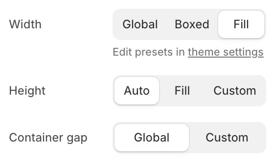
Use this setting when you want to adjust the section size.
-
Width: Control the section's content width:
- Global: Uses the theme's default page width.
- Boxed: Uses a custom max-width container (1200-1800px).
- Fill: Content spans the full browser width.
-
Height: Control the section's height:
- Auto: Height adapts to the content.
- Fill: Section fills the full viewport height (100vh).
- Custom: Set a specific height in viewport units (0-100vh).
-
Container gap: Adjust the spacing between the section container and the left/right edges of the viewport:
- Global: Uses the theme's default container gap.
All global value settings are defined in the Theme Settings. View Theme settings.
2. Appearance
You can choose from the following four background types: color, gradient, image, or video.
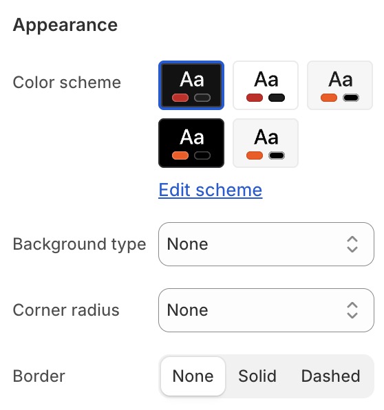
- Color scheme: Choose a color scheme from your defined color schemes. View Color schemes.
- Background type: Choose from the following four background types: color, gradient, image, or video.
- Background color: Solid color background.
- Background gradient: Gradient background.
- Background image: Image background with optional parallax.
- Background video: Video background (auto-playing, muted).
- Background overlay: Add a color overlay on top of the background.
- Corner radius: Control the corner roundness of the section.
- Border: Set border width, color, and style.
3. Padding
You can flexibly customize the four padding sides on desktop and mobile.
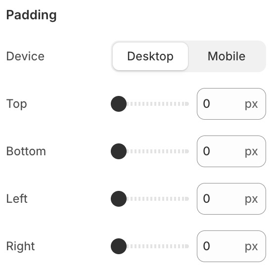
- Padding (desktop): Top, right, bottom, left padding from
0to100px. - Padding (mobile): Separate padding values for mobile screens from
0to100px.