Article card blocks
Article blocks are designed for displaying blog content — article cards, titles, descriptions, and media. Use them to showcase your blog posts throughout the store.
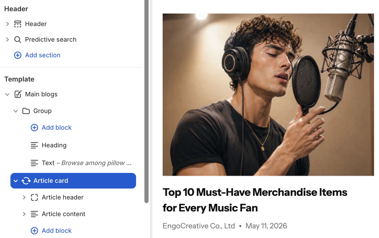
Settings
- Article: Select a specific article or use dynamic context.
- Color scheme: Apply a color scheme to the card.
- Background: Color, gradient, or transparent.
- Border radius & border style: Card edge styling.
Article card's blocks inside
| Block name | Description |
|---|---|
| Article media | Show article image |
| Article title | Show article title |
| Article description | Show article excerpt/content |
| Article tag | Show article tag |
| Article button | Show "Read more" button that links to the blog post detail page |
| Published at | Show article author and publication date |
Article media settings
- Aspect ratio: Auto, square, portrait, landscape, or custom.
- Border radius: Corner roundness.
- Animation: Image entrance effect.
Article title settings
- Tag: HTML heading tag (H2-H6).
- Typography: Font, size, weight, color, letter spacing.
- Line clamp: Limit the number of visible title lines.
- Link: Automatically links to the full article.
Article description settings
- Line clamp: Limit visible text lines.
- Typography: Font, size, weight, color controls.
Article tag settings
- Typography: Font, size, weight, color controls.
Article button settings
- Text: Button label (default: "Read more").
- Button type: Primary or secondary.
- Button variant: Filled, outline, or ghost.
- Size: Small, medium, or large.
Published at settings
- Date format: Choose how the date is displayed.
- Typography: Font, size, color controls.