Overview
Adam takes inspiration from Shopify's Horizon theme architecture — the powerful block-based design system that enables deep nesting and modular layouts. No Horizon theme code is used. Every component, section, and block is original code, purpose-built for Adam.
Unlike traditional Shopify themes where sections have fixed layouts, Adam's blocks are modular content elements that can be placed inside any section and nested deeply within each other.
What are theme blocks?
Theme blocks are the building blocks of your store's content. Each block is a self-contained component — a heading, image, button, product card, or layout container — that you can add, remove, reorder, and configure from the Shopify theme editor.
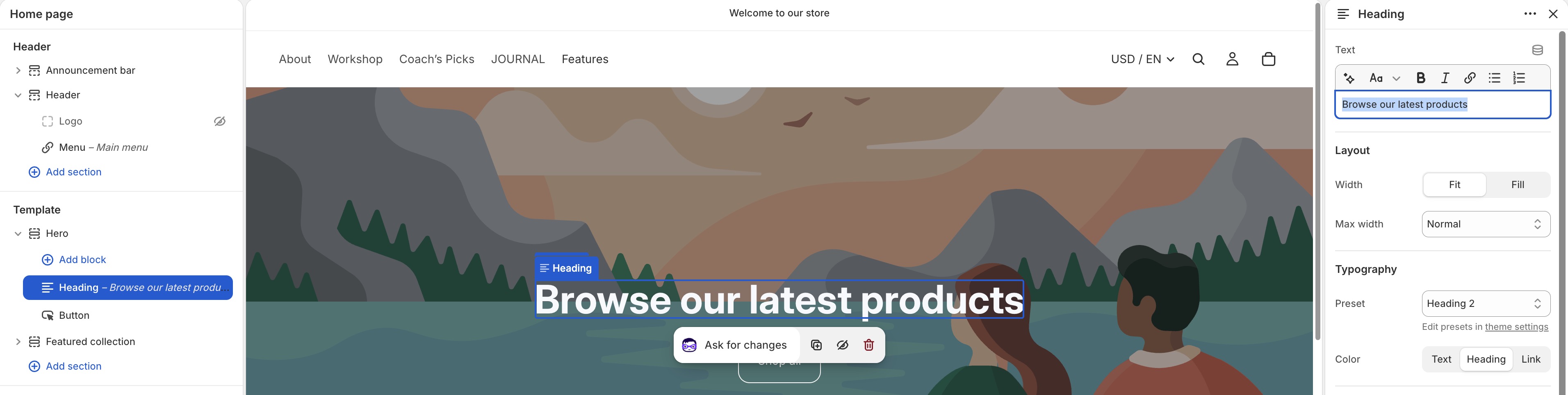
Key differences from traditional themes:
| Feature | Traditional themes (OS 2.0) | Adam theme |
|---|---|---|
| Block nesting | Up to 2 levels | Deep nesting (8+ levels) |
| Block placement | Blocks tied to specific sections | Any block in any section |
| Layout control | Fixed section layouts | Flexible group & layout blocks |
| Customization | Section-level settings | Per-block settings |
How theme blocks work?
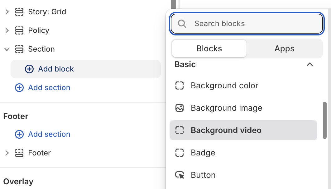
- Add a section to your page (e.g., a blank Section or a Hero Banner).
- Add blocks inside the section — headings, text, images, buttons, etc.
- Nest blocks using
GroupandLayoutblocks to create complex layouts. - Configure each block individually — colors, spacing, typography, animation. View Block settings
Block types
Here is a categories of the blocks that you can find on the Adam theme:
-
Public blocks: You can see them when
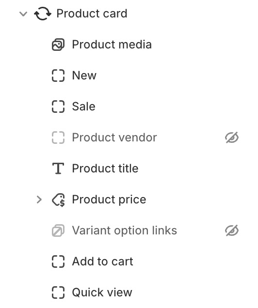
adding blocksinside a section in the Editor.Categories blocks Description Article Displays the article card, commonly used in theblog list. View Article card blocks.Basic The fundamental content elements — Heading, Text, Image, Button, Icon, Video, Divider, Spacer, and more. View Basic blocks Collection Displays the collection card, commonly used in thecollections listsection. View Collection card blocks.Footer These blocks usually appear in the footer, but you can use them in any section if needed. Forms Blocks for creating a submit form. Layout Container blocks that organize other blocks — Group (flex container), Layout (grid/carousel/masonry), and Carousel controls. View Layout blocks Links Used to create links, commonly used in the header and footer. Product Displays the product card, commonly used in theproducts listsection. View Product card blocks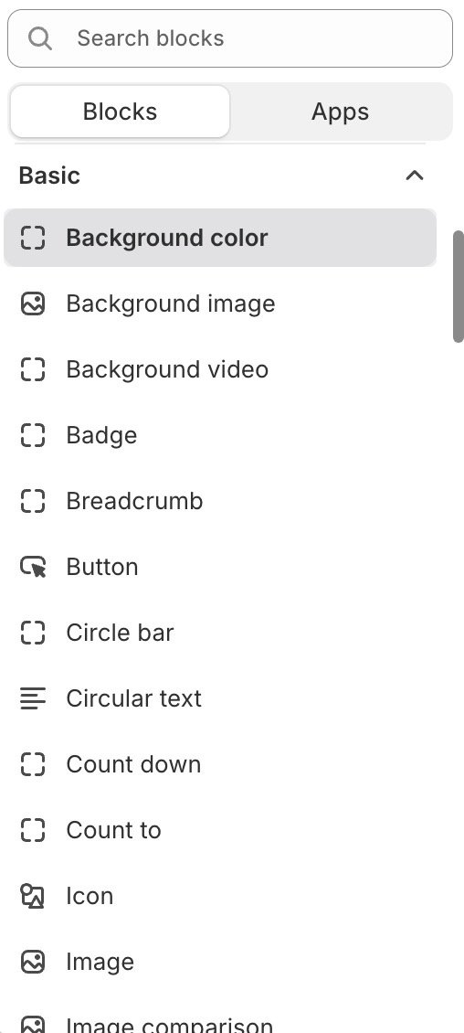
-
Private blocks: You
can'tsee them whenadding blocks, but you can see them inside several sections or blocks. These are blocks that are called within Liquid files. They only work locally in specific contexts — for example, they may require product data to be passed in, or are only suitable for certain fixed section styles.