Basic blocks
Every basic block in this theme is designed to work in any section, providing unlimited flexibility. You can mix text, images, buttons, and custom content anywhere in your store. There are countless blocks in the theme, but most of them are built from these base blocks.
1. Reveal heading
The Reveal heading block displays a text heading with rich typography controls.

Settings:
- Text: The heading text content.
- Tag: Choose the HTML tag (H1-H6) for SEO and hierarchy.
- Highlight decoration: Add underline, circle, or stroke decoration to specific words.
- Typography: Custom font, size, weight, color, opacity, letter spacing, and text case.
- Animation: Fade, slide, zoom, or rotate entrance effects.
2. Text
The Text block displays rich text content with formatting options.

Settings:
- Rich text: Full rich text editor with formatting.
- Link: Optional link wrapping the text.
- Reveal text: Enable a gradual text reveal effect.
- Typography: Custom font, size, weight, color, opacity, line height.
- Line clamp: Limit the number of visible text lines.
- Hover effects: Change color or opacity on hover.
3. Image
The Image block displays an image with aspect ratio and animation controls.
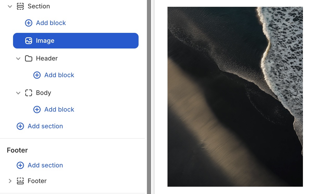
Settings:
- Image: Select an image from your store's library.
- Link: Optional link wrapping the image.
- Aspect ratio: Auto, square, portrait, landscape, or custom ratio.
- Border radius: Control corner roundness.
- Animation: Default zoom-out animation; also supports fade, slide, and more.
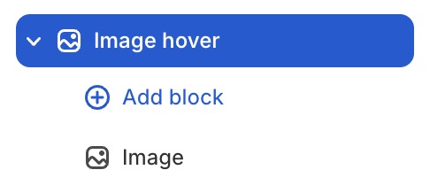
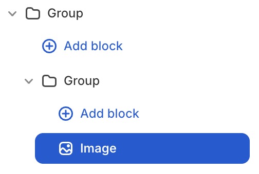
You can wrap image block with image hover block or nest another Group block inside Group block to create hover effect to image.
4. Button
The Button block creates a clickable button with flexible styling.

Settings:
- Text: Button label text.
- Link: The URL the button links to.
- Button preset: Preset styles: Split, Fill up and more.
- Variant: The colors of button: Primary color, Secondary color and more.
- Size: Small, medium, or large.
- Width: Fit content or fill available space.
- Icon: Optional icon displayed alongside the button text.
- Border radius, shadow: Additional visual controls.
5. Icon
The Icon block displays an icon from Wave's built-in icon library or a custom image.
Settings:
- Icon type: Built-in icon or custom image.
- Icon style: Preset style or fully custom.
- Size: Set the icon width and height.
- Link: Optional link wrapping the icon.
- Color: Icon color and background color.
- Background: Color, gradient, or transparent background.
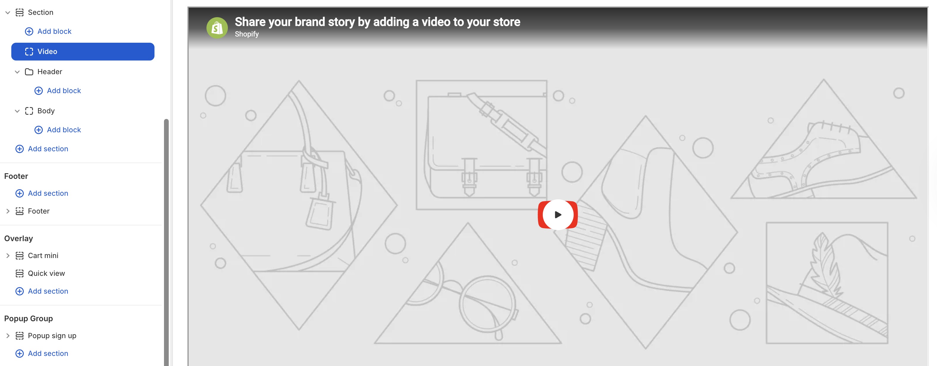
6. Video
The Video block embeds a video from Shopify's media library or an external URL.
Settings:
- Video source: Shopify-hosted video or external URL (YouTube, Vimeo).
- Cover image: Thumbnail displayed before the video plays.
- Autoplay: Enable automatic playback.
- Loop: Enable continuous loop playback.
- Controls: Show/hide video player controls.
- Aspect ratio: Auto or custom aspect ratio.
- Play button: Customize play button icon size and color.
7. Divider
The Divider block adds a horizontal line separator between content.

Settings:
- Text: Text displayed above the line.
- Divider weight: Divider line thickness.
- Style: Solid, dashed.
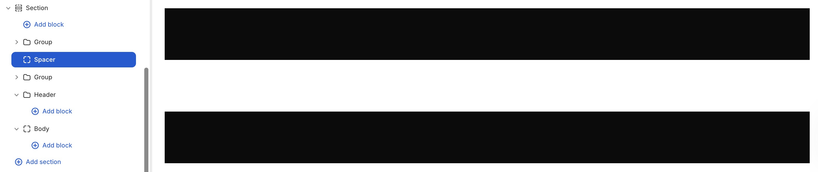
8. Spacer
The Spacer block adds vertical spacing between blocks.
Settings:
- Direction: Adjust the spacer size in the vertical or horizontal direction.
- Size: Set the spacer size.
9. Countdown
The Countdown block displays a countdown timer to a specific date or an evergreen timer.

Settings:
- Timer mode: Fixed date or evergreen (recurring).
- Fixed time: Set the target date and time (for fixed mode).
- Evergreen unit & value: Set the countdown duration (for evergreen mode).
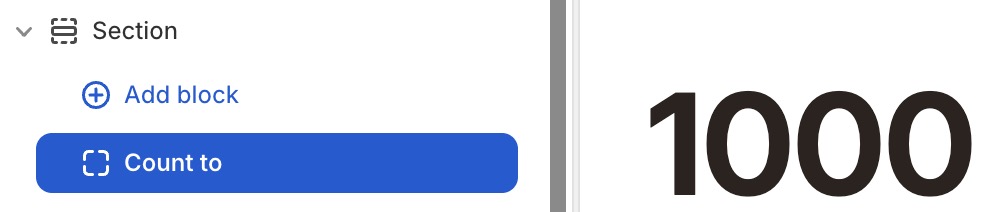
10. Count To
The Count To block animates a number counting up to a target value, useful for statistics and impact sections.
Settings:
- Start/End value: The start/end number of the counting duration.
- Duration: How long the counting animation takes.
- Time delay: Time delay before the counting starts.
11. Marquee
The Marquee block creates a scrolling text or icon ribbon.

Settings:
- Direction: Forward or backward scrolling.
- Speed: Movement speed (1-10).
- Pause on hover: Stop scrolling when hovered.
- Spacing between items: Space between repeating items (desktop and mobile).
- Child blocks: Add Text and Icon blocks inside the marquee.
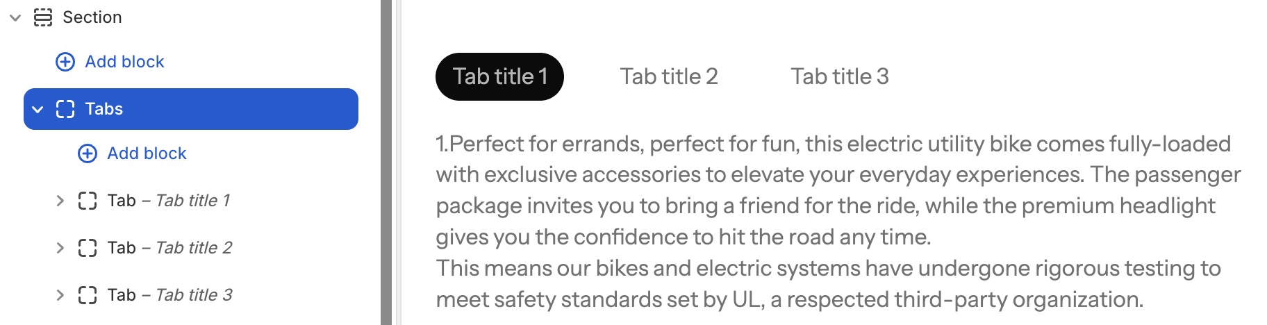
12. Tabs
The Tabs block creates a tabbed interface to organize content.
Settings:
- Tab active: Set which tab is active by default.
- Direction: Horizontal or vertical tab layout.
- Gap: Space between tab items.
- Child blocks: Add Tab Item blocks, each containing its own content blocks.
13. Additional blocks
| Block name | Description |
|---|---|
| Custom liquid | Add custom Liquid code directly. |
| Newsletter form | Email signup form. |
| Contact form | Contact form with customizable fields. |
| Social media | Social media icon links. |
| Review stars | Display a star rating (1-5). |
| Circle bar | Circular progress bar for statistics. |
| Image comparison | Before/after image slider. |
| Menu | A list of navigation links. |
| Input | Form input field. |
| Progress bar | Horizontal progress bar. |