Layout blocks
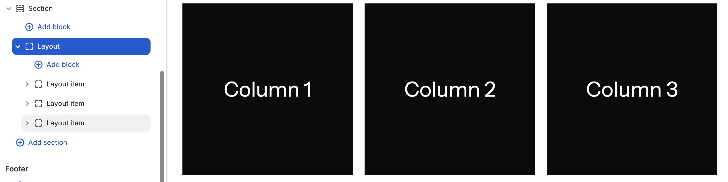
The Layout block is a more powerful container that supports grid, carousel, and masonry layouts. Use it when you need structured multi-item displays.
Settings
- Grid: Displays items in a responsive grid layout.
- Columns (desktop/tablet/mobile): Set the number of columns per breakpoint.
- Gap: Space between grid items (global or custom).
- Carousel: Displays items in a horizontally scrollable carousel.
- Columns (desktop/tablet/mobile): Items visible at each breakpoint.
- Per move: How many items to advance per navigation action.
- Effect: Slide, fade, nature, water, or urban transition effects.
- Speed: Transition animation speed.
- Auto play: Enable automatic slide advancement.
- Loop: Enable infinite loop scrolling.
- Auto height: Adjust height based on current slide content.
- Masonry: Displays items in a Pinterest-style masonry grid.
- Columns (desktop/tablet/mobile): Number of columns per breakpoint.
- Gap: Space between masonry items.
Presets
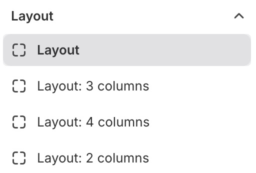
Layout comes with pre-configured presets for common column counts (2, 3, and 4 columns).
Note
caution
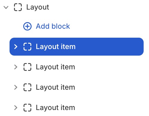
Only Layout item blocks can be added inside. View Layout item blocks
tip
When using a Layout block in carousel mode, you can add these companion blocks to control navigation. These blocks are added outside the Layout block but still remain within the same section.

